Friday, April 26, 2024 | Today's Newsletter | Login
The one chart that explains almost everything
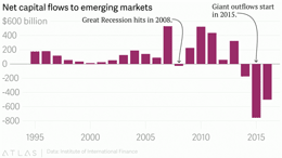
Photo caption: What it feels like to be an emerging market investor right now. (Reuters//Mark Blinch)
By Matt Phillips
Special to The Post
If you want to understand the state of the economic and financial world right now, this is the best chart to have.
This is what it helps explain: slowing global growth (The emerging market investment boom is kaput.); the weakening Chinese economy and currency (Cash is pouring out the middle kingdom.); the relativelystrong dollar and the weakness of US exports; the movement of real estate in Vancouver, Sydney and London; the Chinese corporate foreign acquisition spree; the sharp collapse of iron prices; the surging prices of gold; and, on and on and on.
Numbers released from Institute for International Finance Friday show net capital outflows from emerging markets hit roughly $755 billion in 2015, including the group’s best guess for so called “unrecorded outflows.”
That follows the more than $175 billion in outflows registered in 2014. Moreover, IIF’s new forecast calls for at least another $500 billion in outflows in 2016.
What are “unrecorded outflows”? Many emerging markets such as China closely control the flow of the money in and out of their economies. That leads investors who want to get their cash out of those countries to turn to, say, unconventional methods that often aren’t registered in official accounts.
The upshot? After nearly a quarter century of massive inflows of capital into emerging markets—mostly China—that money is washing out, mostly from China. The IIF expects net outflows from China of roughly $530 billion in 2016, down a bit from the titanic $675 billion that zipped out last year. If you want a longer version of the story, read this.
This piece was originally appeared in Quartz (qz.com). See http://qz.com/657961/the-one-chart-that-explains-almost-everything/
Leave a comment